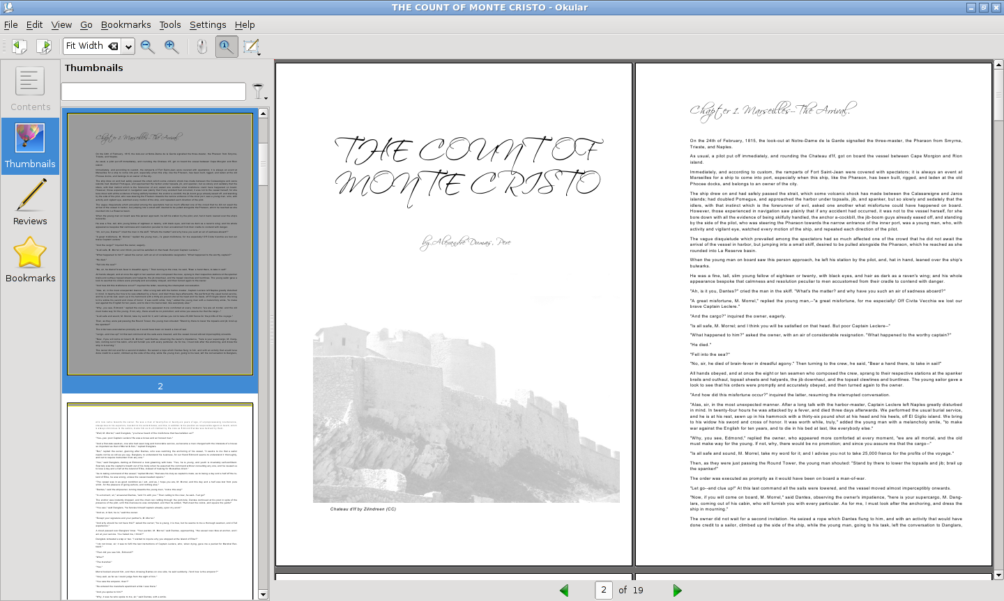
How pretty is rst2pdf's output? Take a look.
I am a big Alexandre Dumas fan. He's the direct ancestor of Neal Stephenson, so many of you should like him too. So I used one of his best books to try some automatic typesetting of project gutenberg texts.
No, the whole book did not convert without errors, and yes, there is some manual work in what you are about to see, but hey, take a look.
Here's a far look of the first two pages:

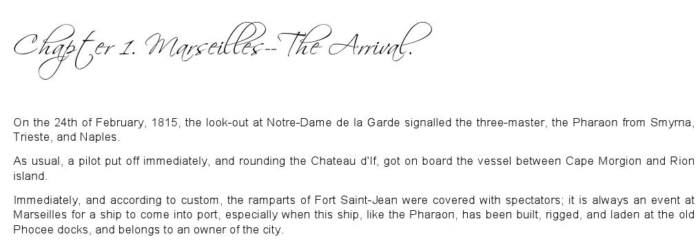
And here's some detail of the typsetting:

Yes, the typesetting is not really LaTeX quality, but it's not bad, either.
Compare it with the HTML version at project Gutenberg. The typesetting is a thing of beauty compared to that :-(
The image is a picture of Chateau d'If from flickr, released under Creative Commons. The title font is Scriptina, I chose it because it looks 19th century but modern.