Posts about rst2pdf (old posts, page 3)
rst2pdf: smartframes branch
Today I started a branch called SmartFrames. The main goal is to achieve a better text flow in the document (for example, for sidebars), and it is starting to get there, slowly.
Let's consider how ReST sidebars are rendered in the different writers.
We'll work with an ordinary lorem ipsum that has a sidebar declared just before it.
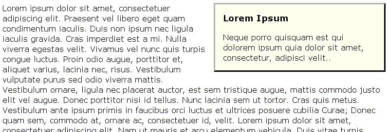
Here's HTML:
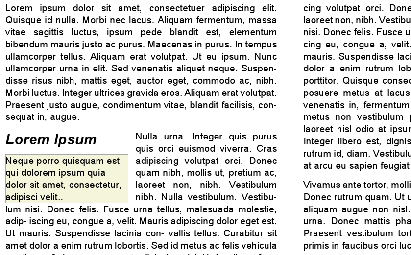
And here's LaTeX:

Each one has its good side and its bad side.
The HTML sidebar is a real sidebar, while the LaTex one is some sort of insert.
OTOH, the ragged text against the HTML sidebar is ... horrid.
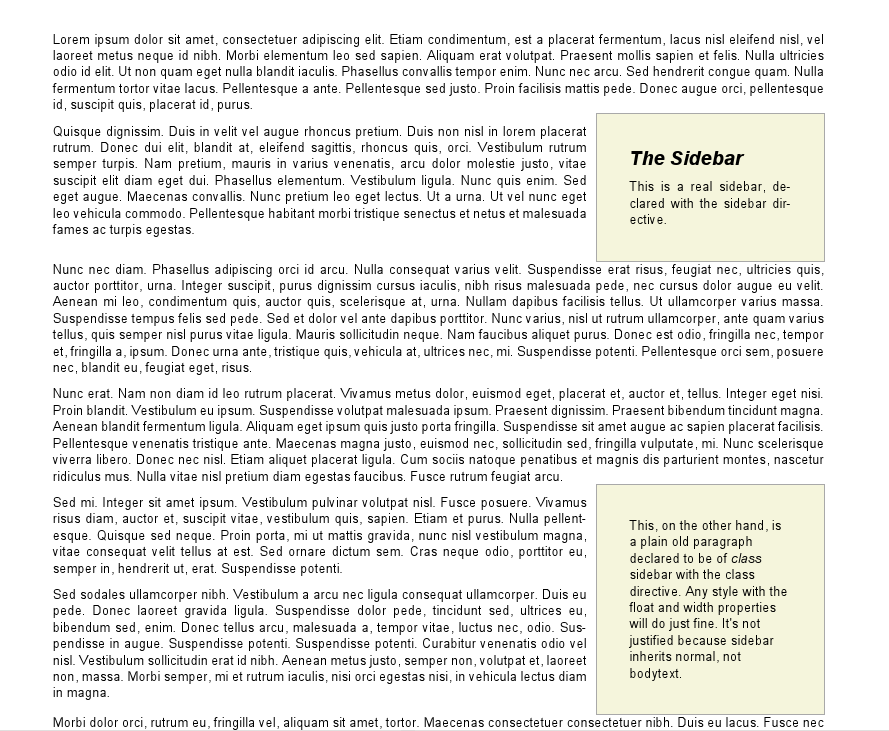
So, I wanted something at least a bit better than that for rst2pdf. In the best of all possible worlds, it would be the neat text alignment of LaTex with the floating HTML sidebar.
Here's how it looks now:
There are some minor problems with the current implementation, such that the sidebar is always aligned to the top of a paragraph, and some spacing issues.
How is it done? Let me tell you: it was not trivial :-)
In fact it's pretty evil, but here's a quick explanation:
When I get a sidebar flowable, I insert a new frame in the page template where the sidebar should go, then call a framebreak, insert the "real" sidebar, a "framecutter" and another framebreak.
The framecutter is a flowable that does nothing visible, but inserts another two frames, one at the right of the sidebar with the same height, and another below the sidebar, full width.
I need to use the framecutter because I don't know the height of the sidebar until after it's drawn.
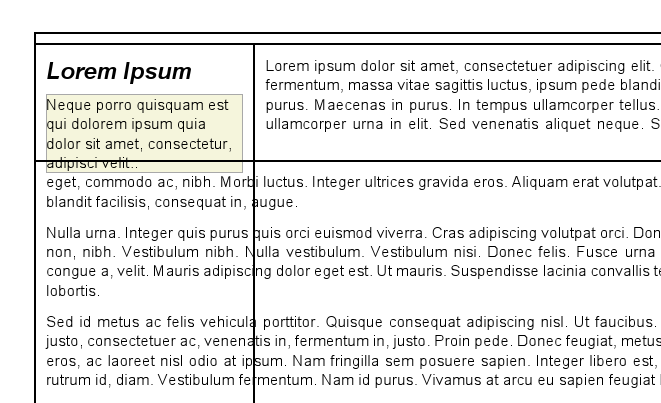
So, we now have 4 frames instead of one:
The original frame, covers the whole page, but has a framebreak above the sidebar.
The sidebar frame, which is very tall, but has a framebreak below the sidebar text.
A beside-the-sidebar frame, short and wide, starting at the right of the sidebar.
A below-the-sidebar frame, wide and tall, starting below the sidebar.
The text should flow from 1 to 3 to 4 neatly and the seams shouldn't show.
Here's a picture that MAY make it clear (there are some odd displacements: those were bugs):
So, I'm not calling it a success yet, but it is looking decent.
rst2pdf 0.6 is out, get it while it's hot!
Many new features. Custom page layouts! Multiple frames per page! Multiple layouts per document! Cascading stylesheets! Not very buggy! Get it at http://rst2pdf.googlecode.com or via PyPI.
Rstpdf wil be released again tomorrow. And it's a good release.
How good? Let me tell you...
Support for PDF table of contents
Section names and numbers in headers/footers
Compressed PDFs (or not)
Guess image sizes. Specially if you meant to use them in a web page and declared just ":width: 50%"
Gutter margin support
Raw directive (insert pagebreaks and vertical space manually)
Offers a docutils-compliant API (and another API, too)
Include full or partial files for code-block. That means you can extract code and show it in your document!
Huge code cleanup lead by Nicolas Laurance.
Working multilingual hyphenation. You can have a per-paragraph language and hyphenate it correctly.
How pretty is rst2pdf's output? Take a look.
I am a big Alexandre Dumas fan. He's the direct ancestor of Neal Stephenson, so many of you should like him too. So I used one of his best books to try some automatic typesetting of project gutenberg texts.
No, the whole book did not convert without errors, and yes, there is some manual work in what you are about to see, but hey, take a look.
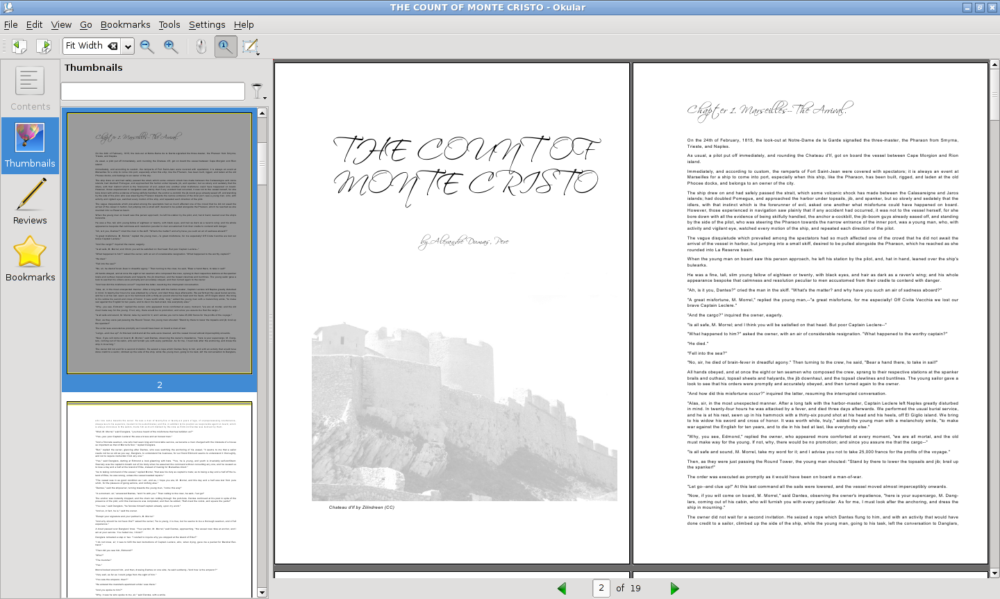
Here's a far look of the first two pages:
And here's some detail of the typsetting:
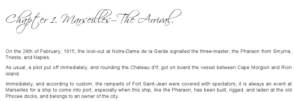
Yes, the typesetting is not really LaTeX quality, but it's not bad, either.
Compare it with the HTML version at project Gutenberg. The typesetting is a thing of beauty compared to that :-(
The image is a picture of Chateau d'If from flickr, released under Creative Commons. The title font is Scriptina, I chose it because it looks 19th century but modern.
