Web Typography
Since I am trying to make my blog into a serious site [1] I decided to take a serious look into web typography. It should be useful if BartleBlog ever gets a second user (which is not precisely coming soon ;-)
Specially since this link appeared in Ned Batchelder's blog.
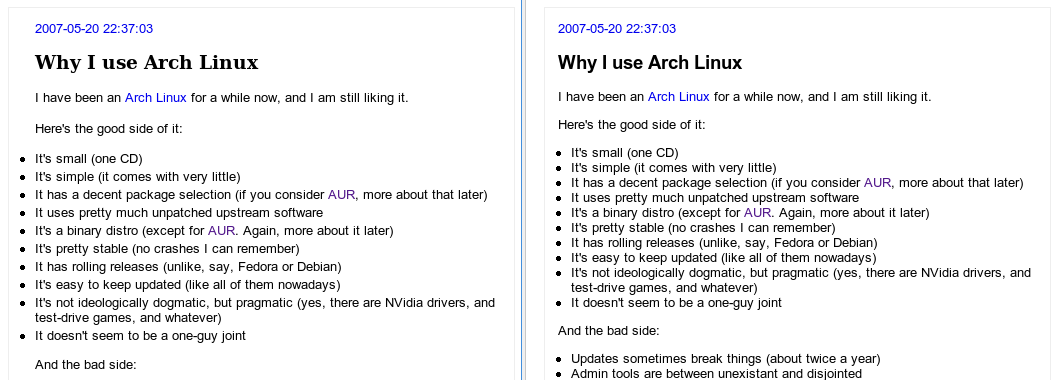
Right now, I am into basic things, like vertical rythm and such, but you can already see a difference:

Now, let's go into more serious material to read on the subject.
I dont like that only two lines of your blog appear in akregator. Why don't you put the full text in the feed?
So you have to come to the site.
Hmmm. If you'd put all text in the feed like most others I wouldn't have to.
It's not convenient enough for me to read your blog, but I can't make you change.
Have a nice day.
Er... yes. If I didn't try to make you come to the site, you wouldn't have to come to the site.
Besides blindingly obvious, I suppose it's also true.
You have a nice day, too!