rst2pdf: What will be new tomorrow
Keeping with my new time-based release schedule, tomorrow is again rst2pdf release day! What will be new in 0.7? Several things!
Fixed several serious bugs, specially with the handling of literal blocks (preformatteds and code blocks).
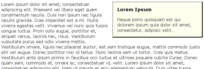
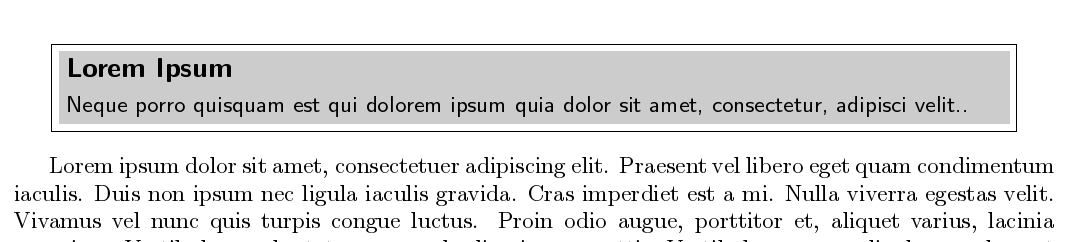
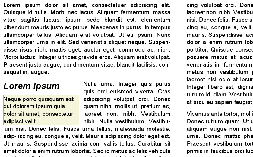
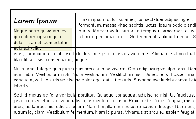
Implemented a rather neat sidebar/floating block mechanism. It only lets you go float-left or float-right but it looks better than what you get in HTML, at least:
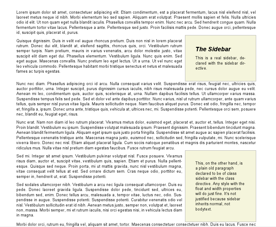
You can even use it to float almost arbitrary objects, so you can have floating images or floating figures.
Fixed the look of hyperlinks. Reportlab had a bug about making some hyperlinks underlined, and those with a black thick underline. Not when you use rst2pdf! Monkey-patched the heck out of that.
Table styling. Let me show you:
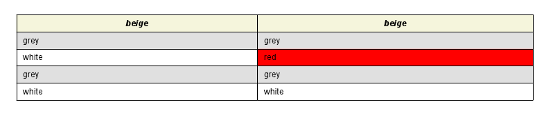
The first row is a header row. It automatically takes the table-heading style.
The following rows are regular, and they take the table style, which has support for zebra tables with alternating colors (white and gray here).
The lone red cell at the right is special. Its content is this:
.. class:: red

red
If you don't know ReST, that means "red" is a paragraph with class red, so it will be styled whatever way that means (here: red background).
Usually that would mean you have a white (or gray) cell with a red paragraph in it. That looks incredibly ugly.
So, rst2pdf tries to be clever: If there is a single element in a cell, it will try to guess the cell background from it.
And as you saw above, it works :-)